Patent Novelty Website
A website which could evaluate the potential value of a patent.
Overview
Brief Introduction
I completed this design project during my outbound exchange in Singapore University of Technology and Design (SUTD), guided by Prof.Luo Jianxi. Generally speaking, I redesigned the user-flow of the website as well as the visual part, and put the design into practice by building the website based on my front-end development skill. Part of the website is not perfect and it works terribly on mobile end because my poor development skill.
- The website is now available. View website
- Code Resource on Github
Information
Sep. 2018 - Nov. 2018 | 2 months | Individual
Schema
01 Understand the theory
02 Design
03 Develop
04 Iteration
05 Conclusion & Take Away
01 Understand the theory
This website aims at using an innovative method to evaluate the potential value of a patent. The method is proposed by Prof. Luo Jianxi and Dr. He Yuejun, SUTD-MIT International Design Center, SUTD. Related thesis as below:
- Yuejun He, Jianxi Luo (2017) The Novelty “Sweet Spot” of Invention. Design Science, 3, e21.
- Yuejun He, Jianxi Luo (2018) Assess Novelty of An Invention Using the Central-Extreme Novelty Matrix: A Case Study of Juvo Lab’s Fibre-Optic Sensor Mat. ICDC, 2018, Bath, UK.
The value of a patent needs more than 10 years to fully show off, so it is difficult to know about the potential value of a patent when it is new to the world. However, the method above points out that the potential value can be forecasted by 2 key factors, the Extreme Novelty and the Central Novelty. When these 2 factors match a specific range, which means the patent is at the “Sweet Spot”, the patent may have a higher potential value.
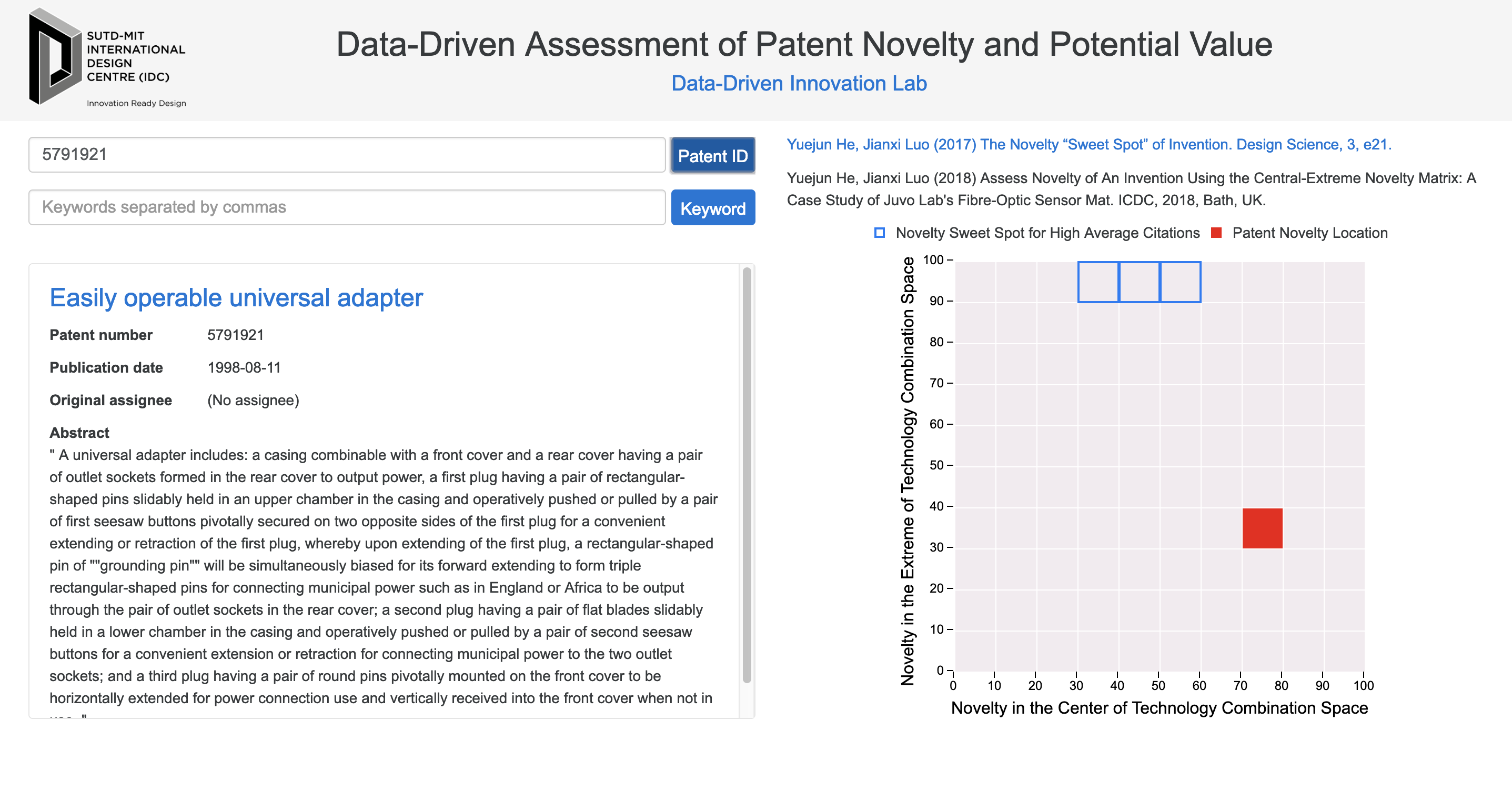
The original website is shown as below and the rectangles with blue border below is the “Sweet Spot”. User enter specific patent ID or related keywords, then click the ‘Search’ button. The result will show on the matrix.
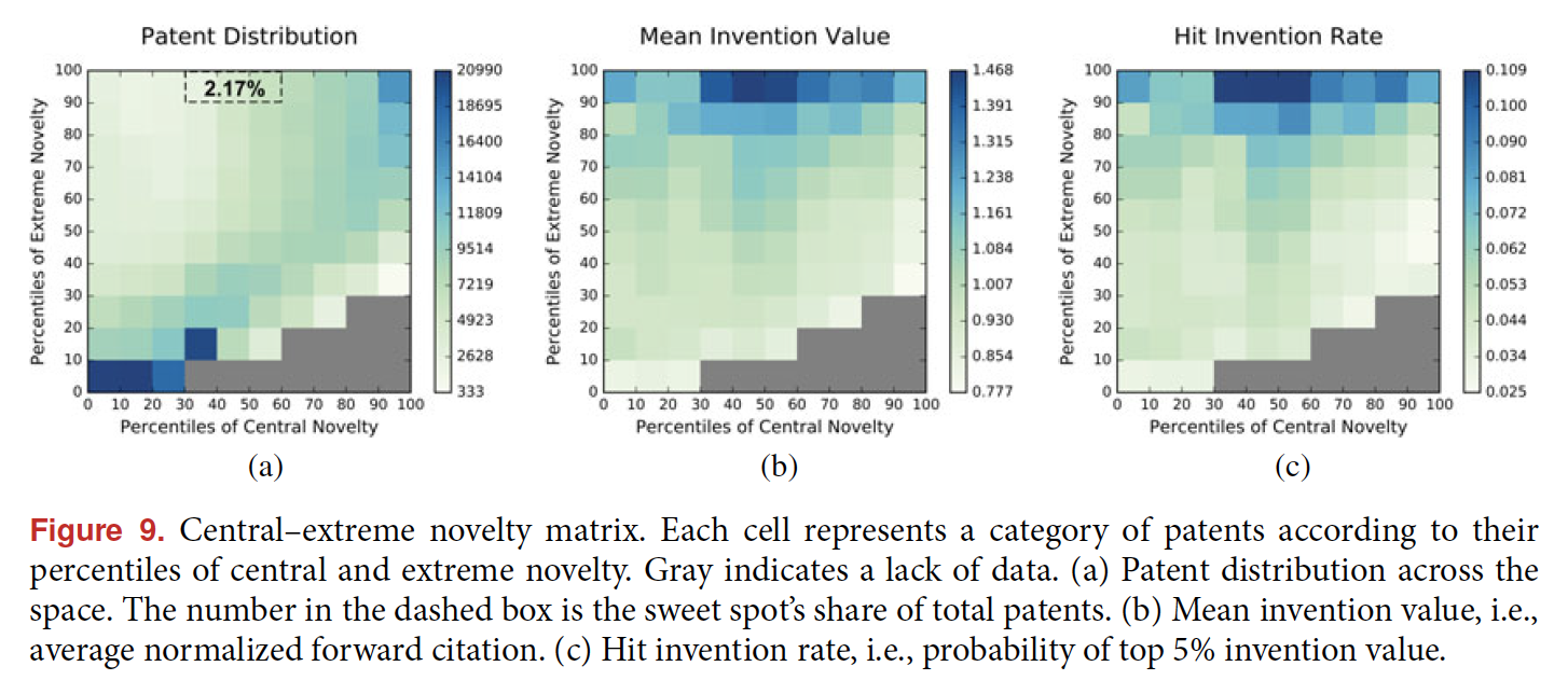
After reading the thesis of this method, I figured out that the thesis provides a completed patent value distribution map. The “Sweet Spot” is just the area with highest potential, and the surrounding area with deep color (show as below) also suggests a high potential value. So, why don’t we just tell the users about the distribution? Otherwise, the user can only know whether the patent is ‘inside’ or ‘outside’ the Sweet Spot, which is meaningless and will make the user upset. Offering more meaningful information will be the first step to redesign the website.
With the understanding of theory and the design goals: - To let first-time user understand the website - To offer more valuable information of the patent to users - To be used smoothly by skilled users
I start my design.
02 Design
Based on the design goals, > - To let first-time user understand the website > - To offer more valuable information of the patent to users > - To be used smoothly by skilled users
My design process is shown as below: - Analyze the user interaction and flow of the original website - Design the interaction framework - Design the structure of the website - User Interface Design
Analyze Original Website
The original website shows as below.
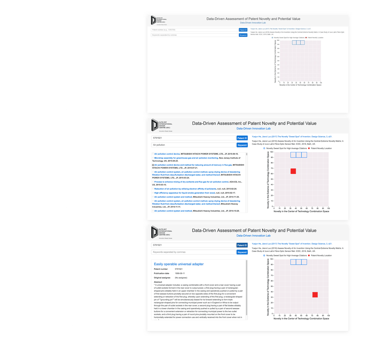
Based on the original website, I draw the user-flow as below.
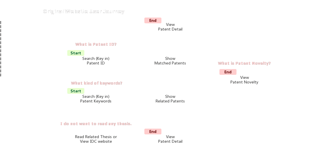
We can figure out that the user would have questions like, what is the Novelty or Extreme Novelty, Central Novelty of a patent? How does the website evaluate it? What if I do not know any patent ID? What does the result mean?
Those questions would make users confused and upset.
Design User Interaction
The essence of the website is a tool, the core value is to provide users with a evaluation to a patent. For a tool, I simply divided to users into 2 kinds, the Naive User and the Skillful User.
For Skillful User, the website should response quickly and provide a high-efficiency user interface. For Naive User, perhaps we can answer the question, what is the website’s function, with a user guide and build confidence. Thus, I plan to implement a Demo to do a case-by-case guide, and also provide a How it works page to show the theory of assessing patent’s value.
The new user-flow framework shows below.
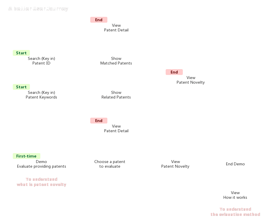
Design Web Structure
With the user-flow, the framework of the website will be, - Home Page - Search Patent ID Result - Search Keywords Result - Demo - Select a Patent - View Result - How it works - About
Visual Design
Then, I used AI to illustrate the visual part of the website and modified the draft many times according to Prof. Luo’s suggestion. In the process, I tried to avoid the unapplicable design based on my front-end developing skill.
03 Develop
Besides the small components like navigation bar, I divided the website into several parts and developed it as order.
Demo Page
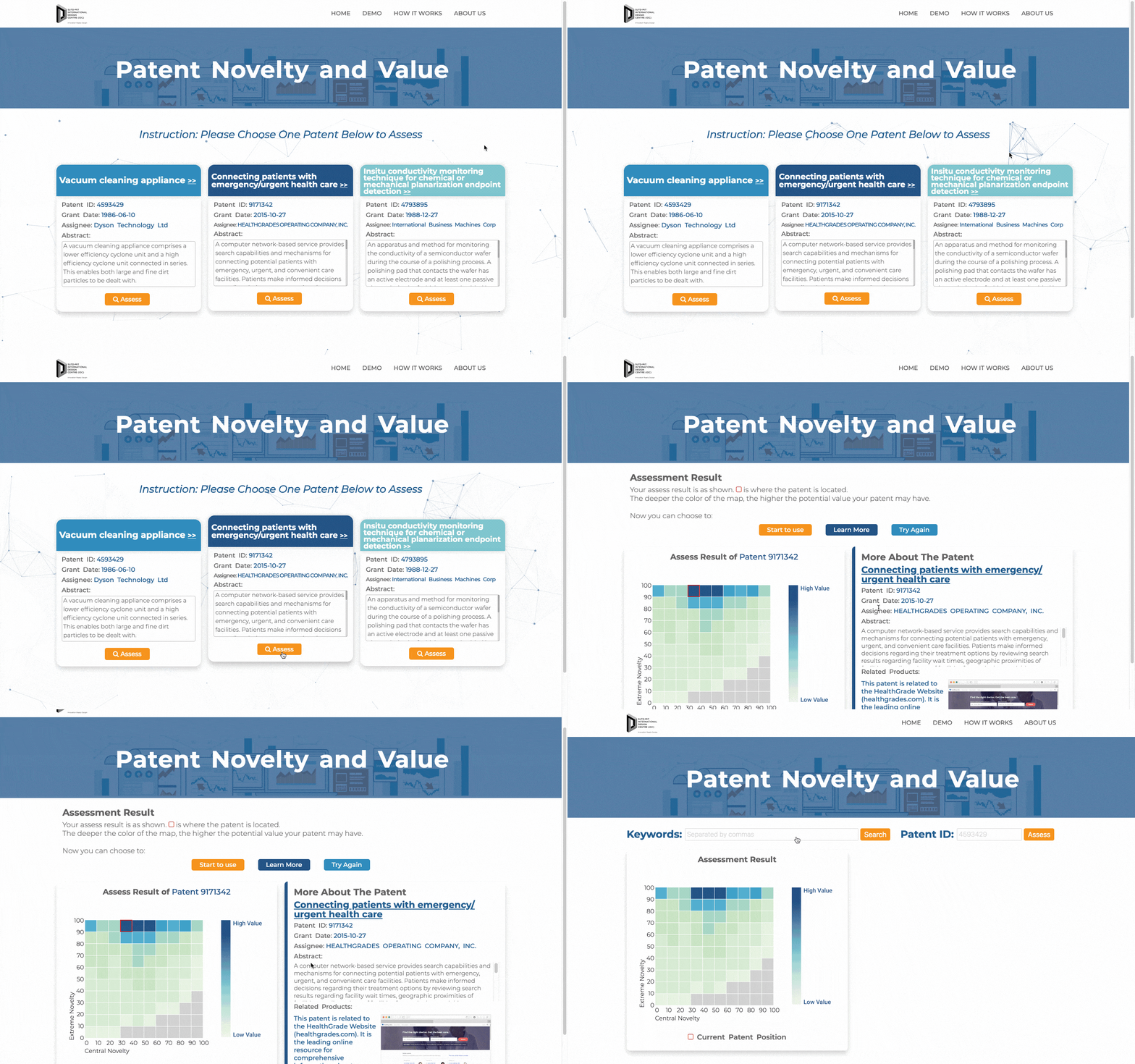
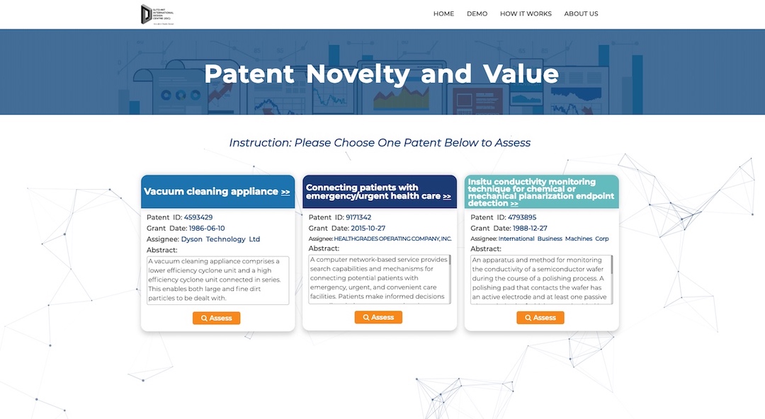
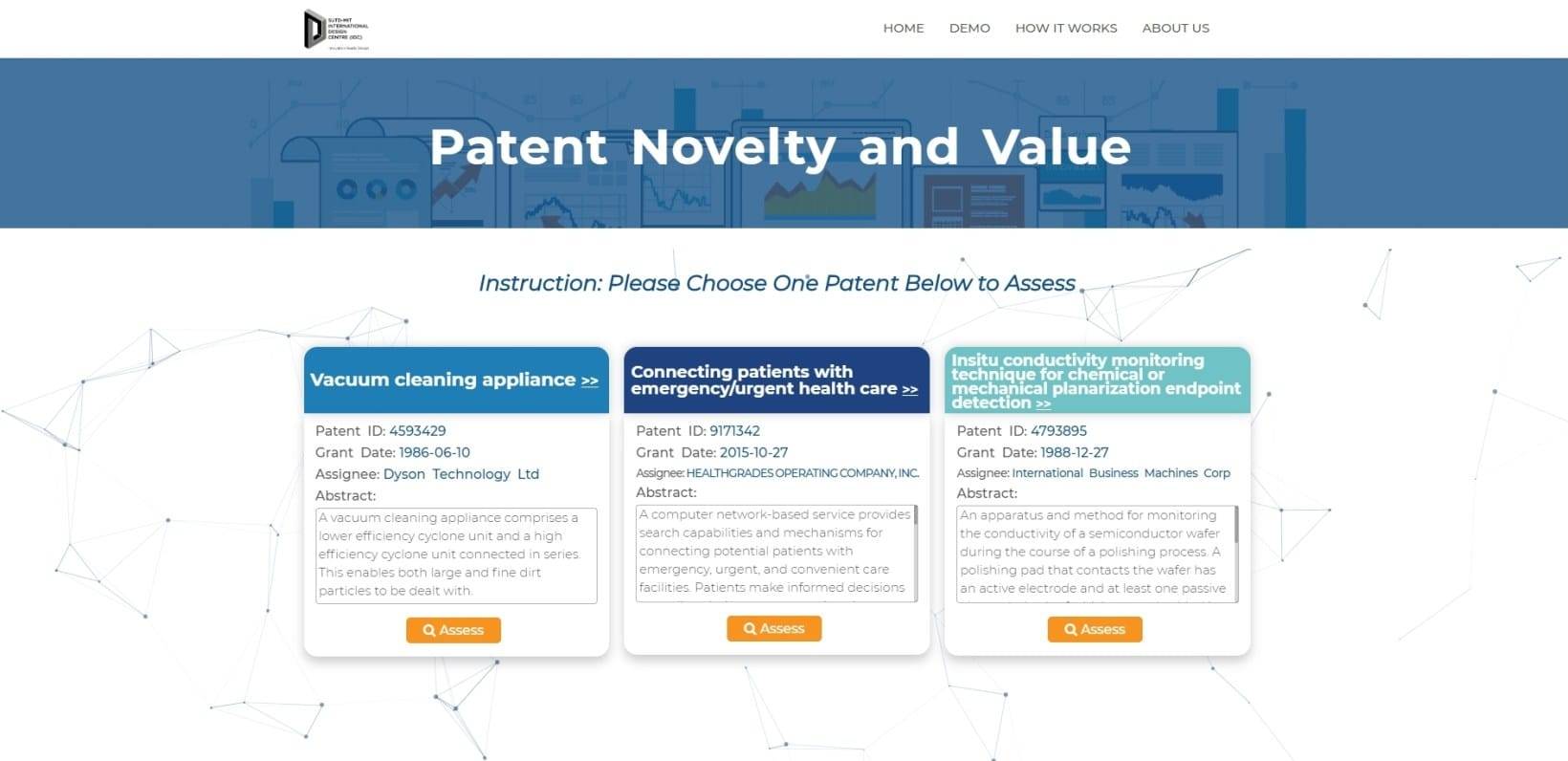 I used Web Cookies to judge whether this is the first time the user browse the website. If so, enter the Demo Page, which would demonstrates 3 patents and asks the user to choose one. These 3 patents are required to be famous and have a relative better result, like inside or near the Sweet Spot. I hope that by this way, the user can get to know what the website is about and how we can use it. Also, the case will help to build confidence since I choose famous patents and the user’s impression matches the result.
Also, I involved particle.js to build some interaction on the website, and bring some tech-feeling.
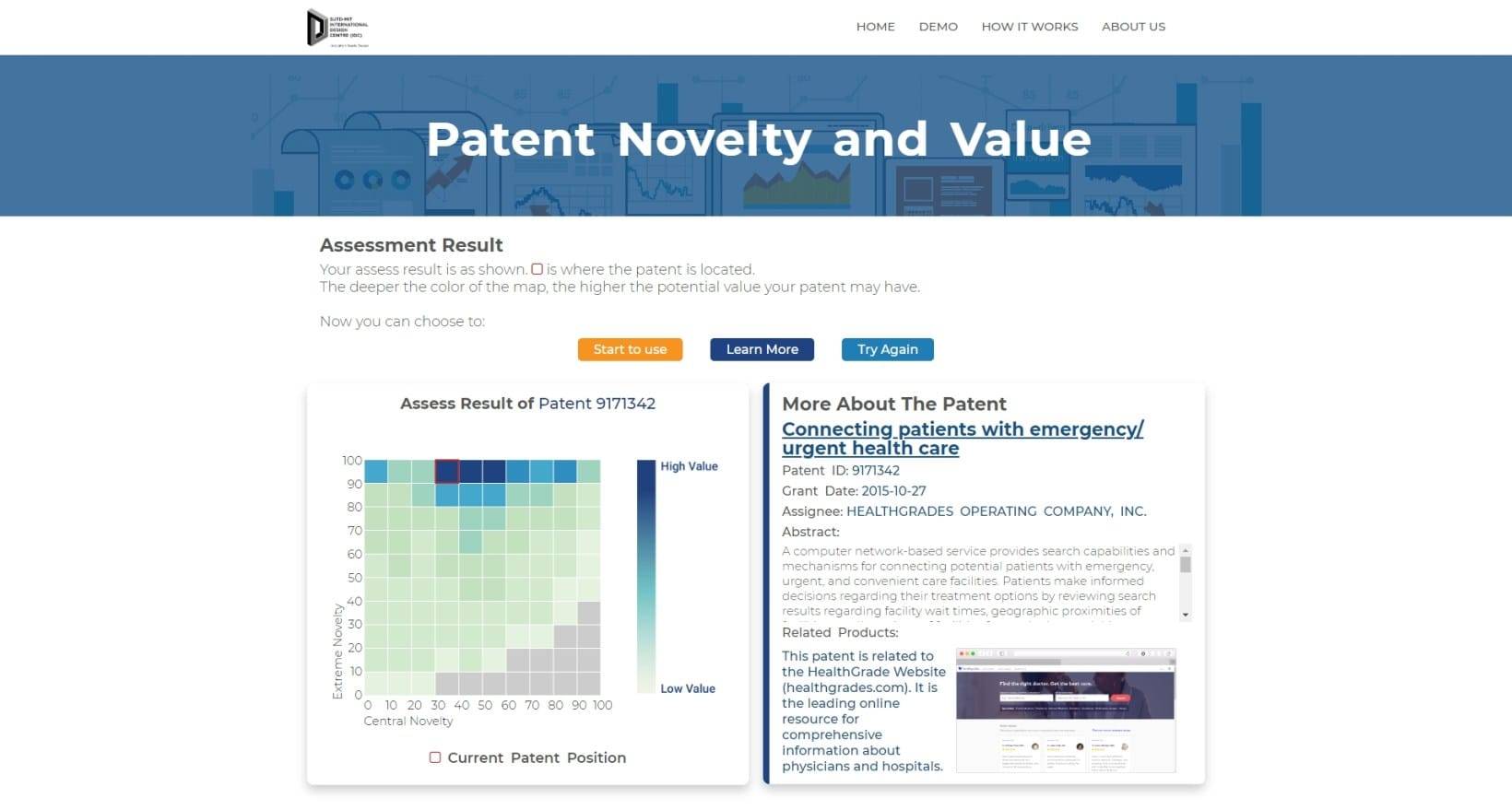
After the user chooses one of the patents to assess, the detail page would demonstrate the result. What’s more, besides the result and the information of the patent, the page would also show the user about the application of the patent in business or products, proving that the result on the matrix is making sense.
Through this page, I would like to let the users know how they can use the website and the meaning of the information. Meanwhile, it can build confidence in users.
Home
Home Page provides the main function of the website, which may be frequently used by skilled users. Basically, it provides two entrances to start a query, searching patent ID or searching patent keywords. The interface is constructed with 3 parts: input box area, matrix area and patent information area. So I modified the website as below: - Adjust the input box - Use the colorful matrix to indicate more information for users - Adjust the information display of patents - Adjust the information display of multi-choice
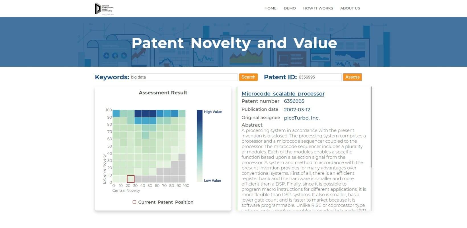
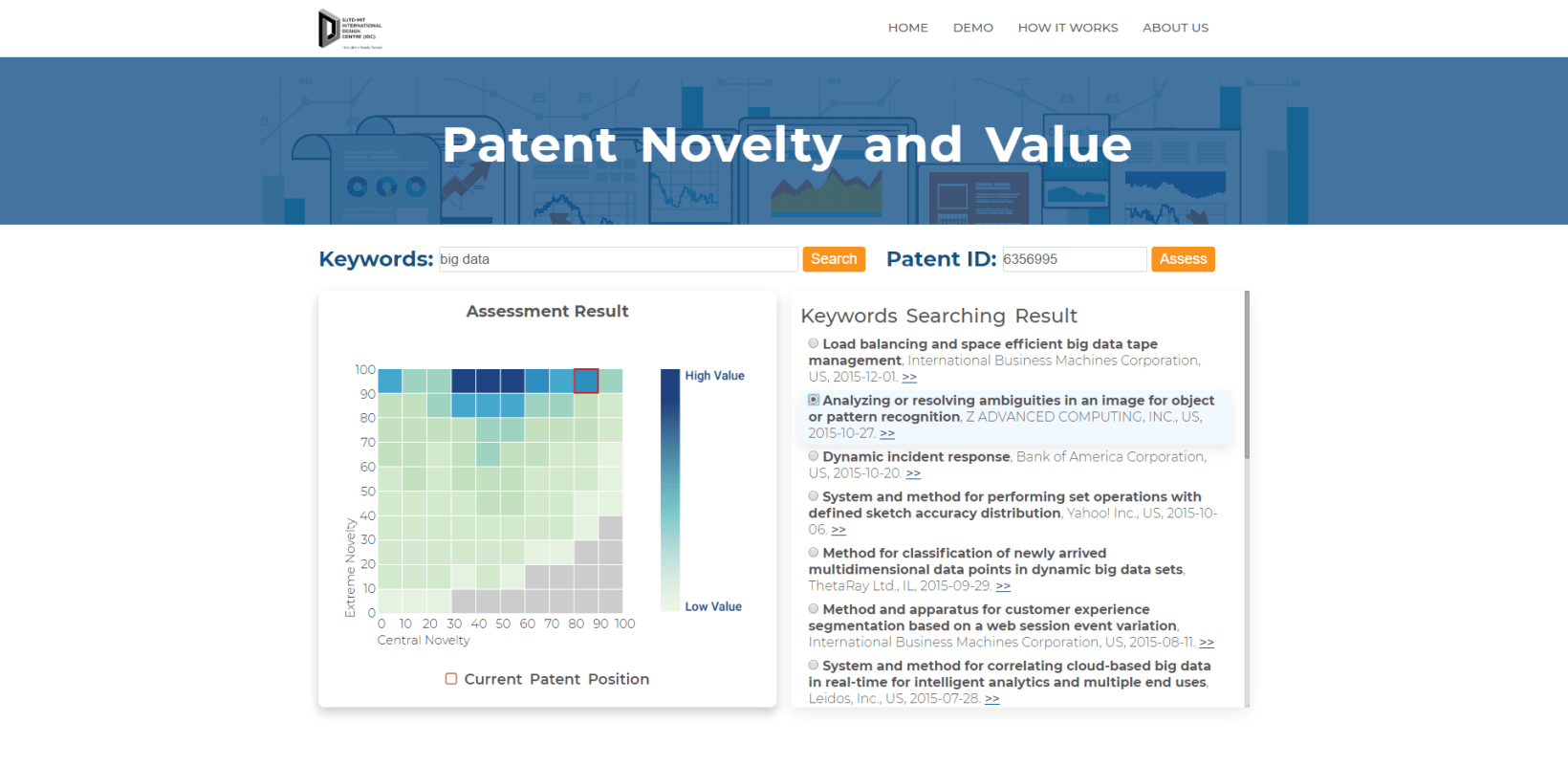
04 Iteration
The first version of the website is not as the screenshots. It has a different way to display information which may cause confusion to new users. To be specific, I modified the below contents: - I modified the display style of the 3 patents on Demo Page - I adjusted the display style of the patent information - I adjusted the display style of keyword searching result
Those adjustment and modification is built on the feedback of my user interview. I let 2 designers and 2 native users to judge the first version website, collecting their questions, usability issues and suggestions.
05 Conclusion
This is my first time that I finished a design and also developed it on my own without any help. Even though the website is not perfect but I am still proud of it.
The biggest shortcoming is that the website is not fit with mobile devices, since I did not adapt development framework. Also, the interface is not perfect with details since I had to put my effort to try to develop it. Also, I did not collect enough data to improve the website in the future.
For Web Design, modularization and iteration is quite essential. I did not have an interactive model library so many basic contents will be difficult designs for me.
